Like the out-of-shape health coach or the financial consultant who carries loads of personal debt, SPARK recently found ourselves at a crossroads. We were building client brands and custom websites that looked beautiful and performed magically, but our products were elevated compared to our own website.
Collectively looking in the mirror and investing the effort to level up the SPARK brand was NOT an easy project while we were in the middle of rapid growth. But drinking our own kool aid has led to positive changes in culture and momentum with clients. The rebranding journey has even expanded our horizon for the vision of where the company will be in 5 years.
Here’s the behind-the-scenes scoop for the SPARK Re-Brand.
Before
The story of SPARK began in 2016 when founder Bob Armbrister launched a system for solving business problems with practical technology solutions from our Kalamazoo, MI headquarters. Through organic growth (mostly client referrals) and the acquisition of a digital agency, SPARK doubled year-over-year. By mid 2019 we realized that our brand didn’t match the services, team, or client experiences that we now collectively provided across our 3 offices.
Old website:

Our original brand was very formal, masculine, passive, and mostly black and white. These designs made sense at the time, but as SPARK grew our client base into a more diverse portfolio and expanded their team with the acquisition, the old brand no longer fit SPARK’s culture. It wasn’t enough to simply add in the new capabilities and offerings to the ‘service’ tab on the SPARK site, a rebrand and new website was a must.
Starting Strategically
The design team kicked off the rebrand process by conducting surveys to understand stakeholder perspectives on SPARK’s service offerings, ideal target markets, and company pain-points. Company-wide surveys were also sent capture insights from all employees about SPARK’s visual identity, tone, and brand traits.
Next, the design team led an internal Design Workshop with the leadership team to learn more about the vision moving forward with a new visual identity. Here are some keywords that emerged from the workshop: 
The desired brand traits were then translated into Style Tiles. These tiles help communicate the visual essence of a brand direction. After working through the options with rounds of feedback and iteration, we found a visual direction that better fit our company culture – bold, hype, innovative, and fun!

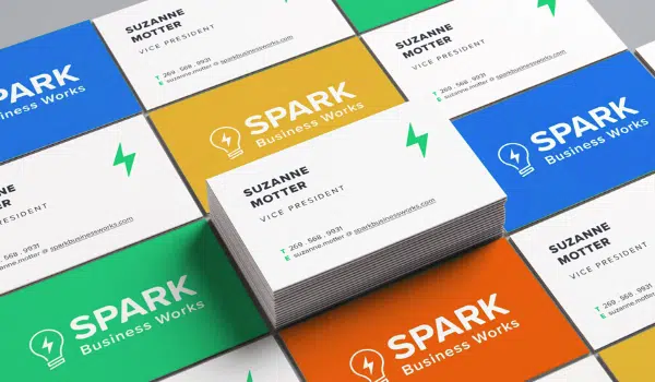
A Better Logo
While flushing out our design direction and moving into web development, the design team shifted their focus to updating the SPARK logo. With the stakeholders, we decided to keep the words “SPARK Business Works,” the lightbulb, and the bolt. These were key pieces in SPARK’s brand identity. Also in the works at the time, was the service offering SPARK Select; which would be a sub-brand of SPARK. The logos were considered together to create a system that would lend itself the opportunity to expand to more sub-brands in the future.
After rounds of logo interactions, we landed on a logo design that felt familiar, but one that was also refreshed and modernized, while also introducing the brand for SPARK Select. The final product:

Website Redesign
After our design direction was chosen and the logo was set, web development was well underway. The team worked through the new site’s architecture, starting by looking at the site holistically. We asked questions like:
- What are people coming to our site for?
- How and where will we display our collective service offerings?
- What are clear and useful calls-to-action?

After deciding key pages and sections of the site, we worked through the finer details for each page and tested our user journeys and created wireframes for the core pages.
Messaging and Brand Language
SPARK has launched wide-ranging software and digital design solutions across dozens of industries. We serve clients ranging from small businesses to large global enterprises. Learning how to talk about our own company to these diverse audiences in clear and meaningful ways was just as difficult as arriving at a cohesive visual identity.
Because it’s so hard to view yourself from an external perspective, we leveraged an outside brand consultant who conducted client interviews and provided insight into the underlying influences that lead to so many successful partnerships and products.
Just a few of the milestones to arrive at our messaging strategy:
- Solidified an overarching Brand Story and Brand Position
- Defined our audiences
- Created messaging briefs by persona

With the foundational strategy for how we talk about “what we do, who we serve, and how we do it” in place, the copywriting began on all 20+ pages of the new website.
Time to Launch!
The unveiling of SPARK’s new branding and website to the team was a fun milestone at our quarterly SPARK Slam internal event.

After
Since the internal soft launch, we’ve slowly been going through the meticulous process of updating all marketing materials, templates, documentation, and other assets. Until fully auditing this entire landscape, it was easy to underestimate how much effort and coordination it takes to cohesively and authentically represent a growing company’s image.

Rebranding SPARK allowed our entire team to experience first-hand the services that many of our clients leverage SPARK’s design team for. The journey increased our collective Design Thinking acumen across all teams in the organization, not just designers.
Now… it’s time to Get Hype!


