Your users constantly make decisions when interacting with your website or app — what button to click, what section to scroll to next, or what fields to fill out. They take these actions to reach their goals, whether it’s finding an answer to a question or submitting a form.
Your job is to understand what your users’ goals are and how to make it as easy as possible to reach them. Otherwise, your users can become frustrated in the process, even abandoning your site before they contact you.
While you may think that your website or app is simple to use, it’s not always the case. You may be giving users too many options at once, causing a poor user experience.
Frustrating Your Users with Too Many Choices
But, how do you know if you’re frustrating your users? Here’s some warning signs to watch for in your analytics:
- Users quickly abandon your site before taking any action (like submitting a form)
- High number of pageviews, but no positive action
- Low number of pageviews per user, suggesting that navigation is too complex
- Users make it to the checkout page, but don’t complete their purchase
- High abandonment rates on pages with important contact forms or surveys
Your users could also be employees using an internal app to complete their daily tasks. In this case, here’s some tell-tale signs of clunky tech:
- Voicing frustration with using the software
- Reluctant to use it on a regular basis
- Inconsistent or wrong data entry
- Wasting too much time using the software
While these signs could indicate a number of issues, it’s a good idea to first consider the number choices you’re giving users and how it impacts their experience.
Improve User Experience with Hick’s Law
Users often abandon their task on your website or app when it takes too long for them to make a decision.
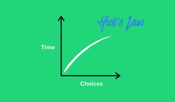
And, this isn’t just speculation. It’s a proven theory called Hick’s Law.
What is Hick’s Law?
Hick’s Law (or Hick-Hyman Law) is named after British and American psychologists William Edmund Hick and Ray Hyman. They examined the relationship between the number of stimuli present and an individual’s reaction time to any given stimulus. They found that the more stimuli to choose from, the longer it takes the user to make a decision on which one to interact with.
What does this mean? The more choices you present to your users, the harder it is for them to make a decision (and it’s work they don’t want to do).

Putting Hick’s Law into Practice
To fix this problem, Hick’s Law suggests to remove the number of stimuli, or choices for your users. With less options, users can make quicker decisions, which leads to a better experience.

Hick’s Law is a popular theory in UX design, and it’s something we follow here at SPARK for our clients when designing websites, apps, and dashboards. It helps us create intuitive experiences that encourage users to take action by making it as simple as possible. Here are a few examples:
Simplifying Forms
SPARK Senior UX Designer Kevin Wolf puts Hick’s Law into practice when designing online forms. For a recent client, he cut down the number of fields on a single page to make the form less overwhelming.

Clear Call-to-Actions
Important call-to-actions should be front and center on your website to make them easy for users to find. See how we positioned “request a proposal” in both the top navigation and above the fold (or top half of your web page).
.png "Think Like a UX Designer: Use Hick’s Law to Improve Your User Experience 4")
Making Data Entry Fast and Simple
This employee app for Esper Electric helps construction workers log what equipment they use on a job site. In a single screen, it simplifies a time-consuming task into a few clicks.

How to Apply Hick’s Law
To apply Hick’s Law, you should first put yourself in the position of your users. What goals do they need to accomplish on your website or app? Then, you can strategize on how to simplify the steps (and time) it takes to achieve those goals.
When looking at your own website or app, there are a few key areas that you can apply Hick’s Law to:
- Online forms
- Call-to-actions
- Data entry on apps
- Checkout process and payment capture
- Site navigation
Whatever you decide to improve, my advice to anyone is, “Always remember to Keep It Simple Stupid.”

Download our Website Prep Checklist
Is it time for your business to update its website? A little thought and preparation before you start can go a long way. Download our checklist to make it easy to plan for a successful project.


